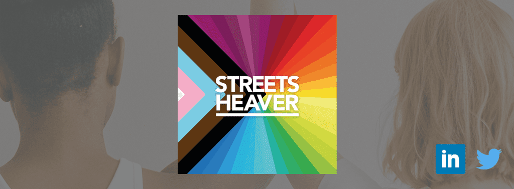
Pride Month: Why We’re Proud To Change Our Logo

Pride Month is recognised as the time of year where people from all demographics, race, religion, and sexual orientation can come together and celebrate acceptance, peacefully.
Companies from around the world have changed their logo to stand in solidarity with the LGBTQ+ community. The important message of equality is more poignant than ever, and the team at Streets Heaver are proud to be supporting this.
The show must go on(line)
We’ve published our new logo across our social media channels to show our support and reflect our work culture. A logo is a mark of distinction, and is illustrative to an organisation’s values and beliefs.
At Streets Heaver, the Pride logo represents the changes we want to see in how we operate, and the changes we want to see in the wider community. We remain committed to actively promoting diversity and equality in our industry, as well as globally.
We stand in solidarity with the LGBTQ+ community
The Streets Heaver Pride logo has been created based on the Pride flag design by Daniel Quasar that focuses on what is important in our current community climate. It builds on the usual Pride flag by adding stripes that emphasise groups within the LGBTQ+ community that often experience marginalisation.
We hope that visually showing our support will encourage others to educate and understand what Pride Month is all about. Whilst there is progress still to be made, let’s also celebrate the forward movement we’ve already seen.
Follow us on our social media channels to keep up to date:
Twitter @StreetsHeaver
LinkedIn /company/streets-heaver-healthcare-computing
Streets Heaver is a leading provider of healthcare software, delivering solutions across the UK and beyond. To find out more, click here.